At the top of wedding planning to-do list is a wedding detail every bit as important as the venue and the date, but usually a bit more fun and a bit less stressful: choosing the wedding colors. Trending in 2013 were fresh tints of classic pastels: blush, robin’s egg, and laurel were a few of the most popular. While those colors will still grace wedding blogs for most this year (don’t expect pale pink to disappear anytime soon!), bright colors are back. Don’t think rainbow or circus, however. The new look blends timeless and modern by working a few bold splashes of one or two colors into surprising details and notes of an otherwise muted palette.
To keep it fun without getting too crazy, choose a neutral hue first, such as gold, almond or eggshell, and then pick your accent color. A few of the best are poppy red, indigo, hot pink, and celosia orange.
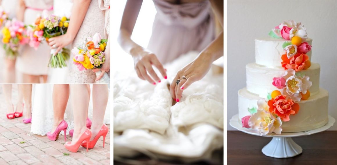
Not sure where to incorporate big pops of color without getting tacky? Try neutral dresses for your bridesmaids—gold or pale grey are trending right now— and add color to details that are traditionally muted, such as accessories, cakes, and ceremony programs.
Instead of pearls or rhinestones, choose bold jewelry; instead of French manicures, tangerine or seaglass lacquer; instead of black or ivory heels, choose fuchsia or peach. For the cake, pick a minimal, clean-looking frosting style such as white, ivory, or even gold, and then adorn with huge blossoms or vivid, elaborate sugar flowers. Try a similar tactic for the programs and other paper goods: pick a pearl or pewter paper and use your accent color for headings, important details, or a hand-sketched floral design at the top or in a corner.
Related articles


