Let’s talk about choosing wedding colors. This is one item on the “to do” list that drives brides crazy. Even we tomboy brides who had no nine-year-old concept of the ultimate wedding — somehow, we instinctively know that nothing can be done until we choose. Those. Colors. And the cake, wedding party attire, flowers — they’re all totally out of the question until we get it straight.
Let’s admit it, most of the advice on choosing wedding colors is awful. How many times can you read that red’s energizing and blue’s soothing without wanting to gouge out your eyes with a toothbrush? And didn’t simply picking your favorite colors lose some of its appeal around the time you stopped eating rubber cement?
Interestingly, there’s a trend afoot to pick the colors that make you look good. For example, if you’re an ash blonde, you’ll probably look fantastic against a backdrop of charcoal or navy blue, and not so great against canary yellow. But maybe you want to save that sort of Machiavellian planning for your first home instead.
Because when it comes to picking colors, you probably want one thing. You don’t necessarily want the colors you’ve loved since Bobby kissed Kimmy in the third grade, assigning Kimmy to your personal hit list forever.
And you probably don’t care about any 17th-century symbolism. You probably don’t need the colors you’d choose from Rorschach blots if Rorschach blots weren’t black. You simply want your colors to be hot. You know, like if Paris Hilton wandered into your reception, that’s what she’d say. Right?
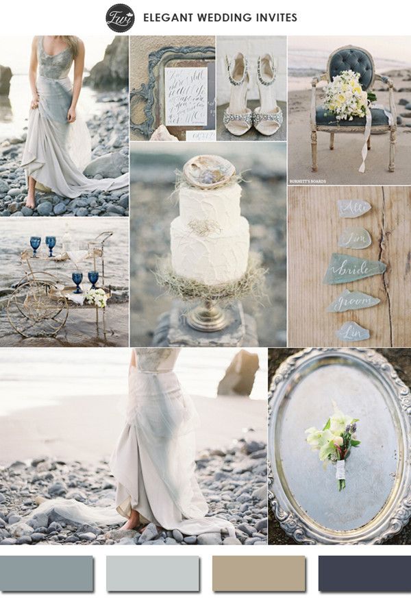 elegantweddinginvites
Seeing’s Believing
To choose hot colors, most of us have to see them. Together. Fortunately, we live in an increasingly design-centric society that makes this dead simple — anyone can go to Target and pick up some sublimely designed stuff for under 30 bucks. Even better for we wired brides, we don’t even have to get out of our butt-cradling chairs.
Start from the top — think like a designer. Go to Pantone’s Trends section, and look over the color picks they’re predicting for this season and next.
For example, Pantone says this year shows a softening of the strong, bright colors that have dominated for seasons past, and what’s happening now is “surprising neutrals” with bright accents … really bright. Really high-energy. Tarragon and Cafe Creme for bases. Hollyhock Purple and Green Sheen (think Granny Smith apples on acid) as accents.
Tuck that in your brainpan, because now it’s time to go shopping for all these colors in action. Although what you’ll see in the catalogs are the ghosts of seasons past, it’s true. Because it takes time for colors to materialize into the flesh of draperies, slip covers and wall paint. That doesn’t matter — the colors you’ll find look fresh, and they’ll still look fresh for your wedding. Ready? Let’s go.
“In”-spiration
Highly designed cards and custom stationery are totally fun way to get a bird’s eye view of what’s hot. Designers have fun with cards. They give into whims. They’re not restricted by what people can stand on their couches. Get a quick color infusion by checking out stationary sites like Elegant Wedding Invites.
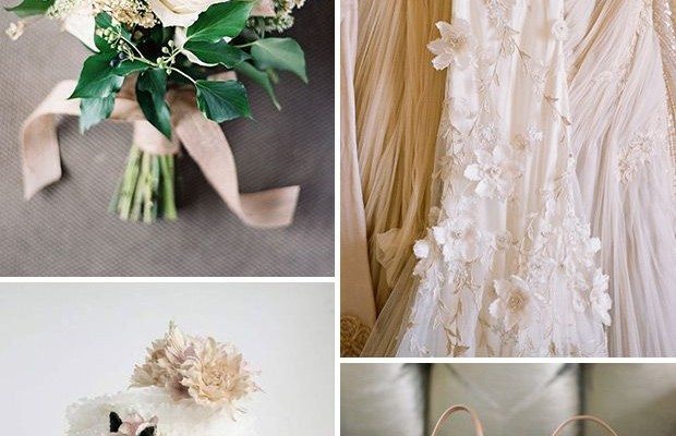
 One Fab Day
“Brown’s the New Black”
You continue to hear that everywhere. Even in weddings — especially in weddings. Want instant confirmation? Let’s go shopping at the right kind of online home furnishings catalogs. Not the ones that are so out there, they’re selling you pink faux-fur cozies for your screwdrivers, and not the ones that are so generic that the only color scheme you can really pick out is red, white and blue.
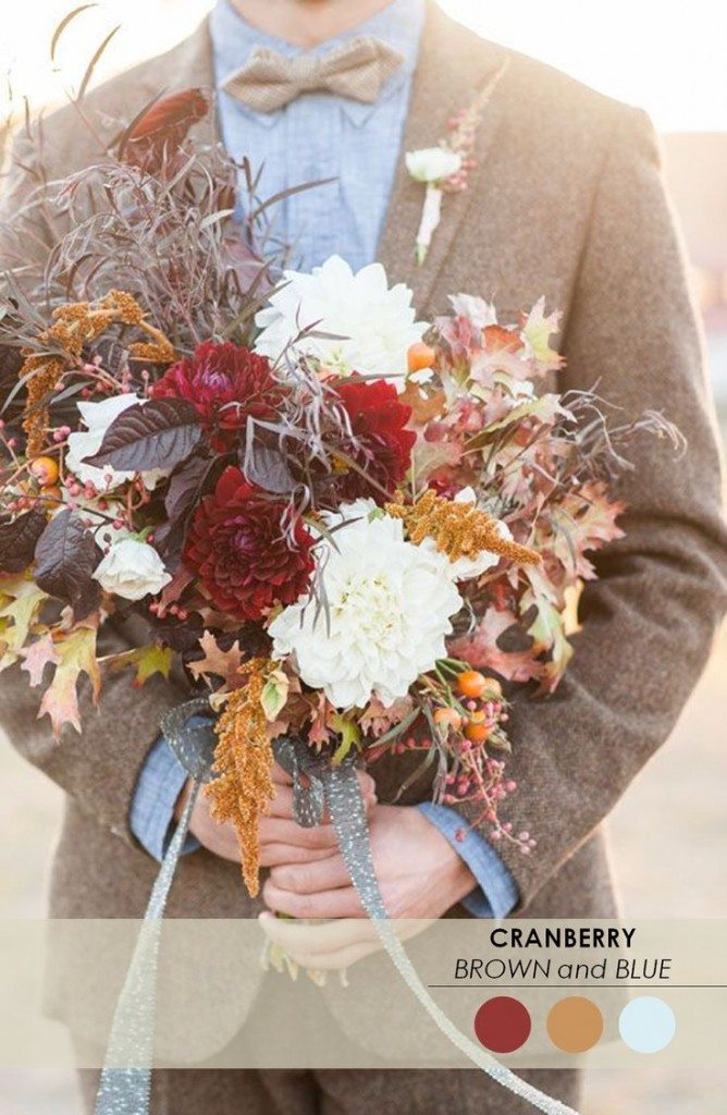
You need to check out companies that are stylish but not freaky, like Pottery Barn and Chiasso. You’ll develop your own techniques, but I think the fastest way to see hot color combos in action is to look at the bedding. Comforters and duvets and quilts are huge canvases on which designers get bold, unlike curtains and couches which are usually safe, neutral and conservative. Let’s check out the brown and blue combo which is hot in any scene, most definitely including weddings.
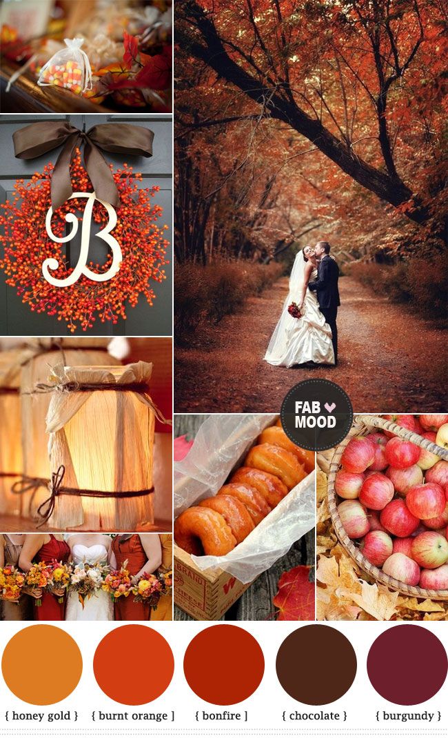 fabmood.com
See the similarities? Inhabit shows you a super-mod interpretation of the same scheme Domain has, only Domain is nostalgic and soft about it. Your wedding could lean one way or the other. You could doll up your cake with any one of these patterns. The colors would be similar, but the looks would be wildly different. You could steal those great op-art shapes from Inhabit and weave them into your invites, your plate chargers, your napkins.
Now let’s peek behind the door at some seasonal color swatches. Pottery Barn shows a lot of bold reds paired with wheats and golds. Oh, and hey, there’s espresso and blue again. Want something funkier? Hey! Brown and blue! But you also see another hot color combo that isn’t quite as obvious: apple green and coral. (Or in West Elm’s playbook, “leek” and “copperplate.” Coral and apple are hot. And they’re hot in weddings, too.
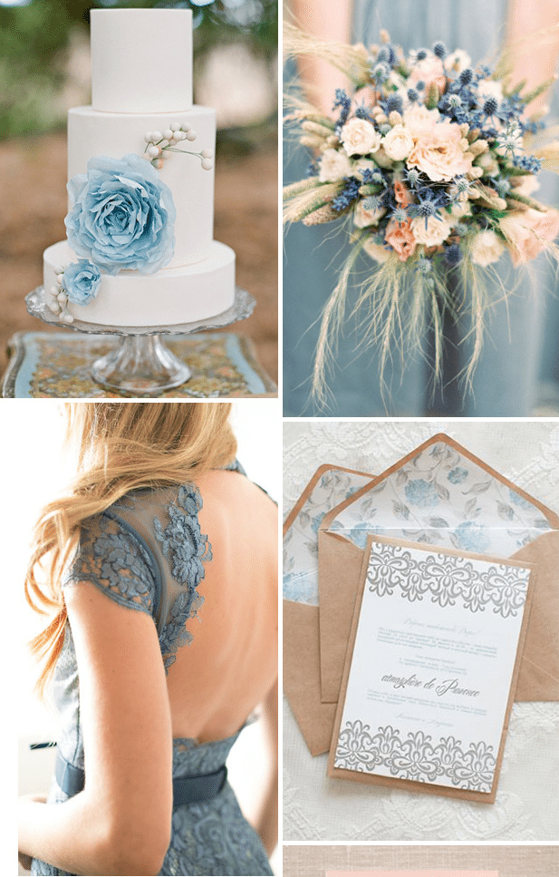
 theperfectpalette
Great. But Could You Just Spell it Out For Me?
Sure. Try this:
But I’m Having a Spring Wedding. What Now?
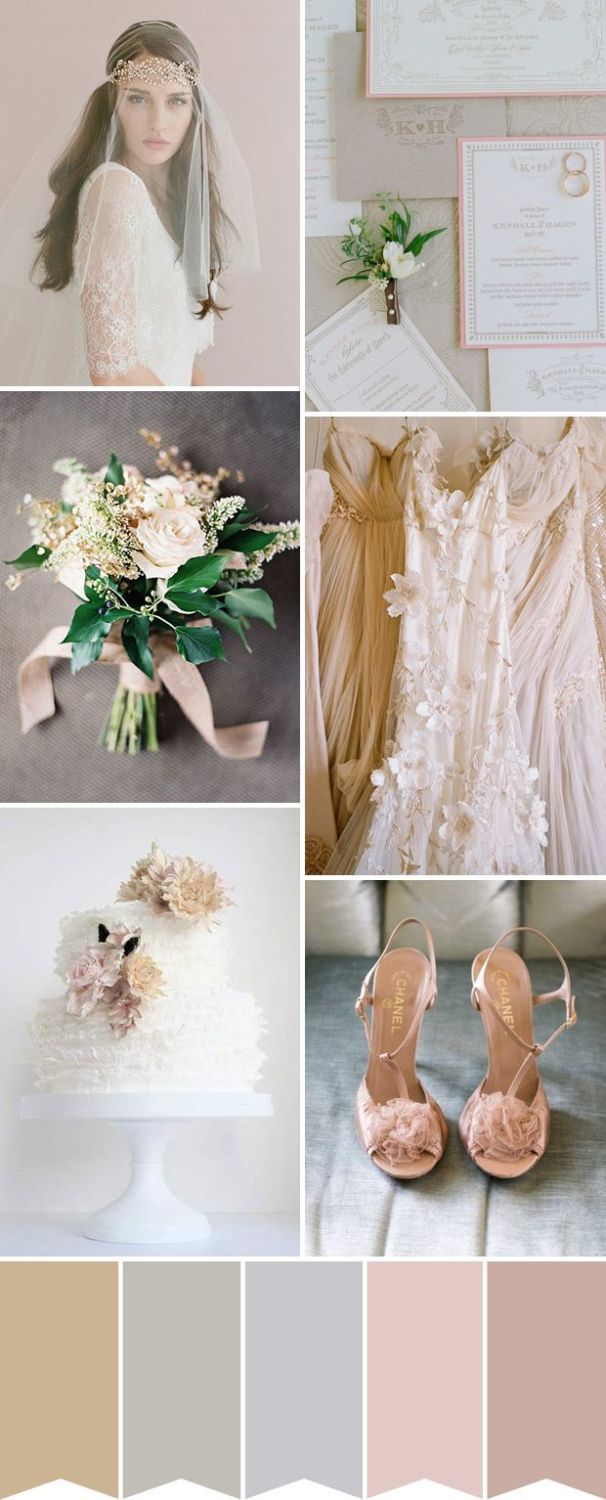
It’s simple: go for taupe. You want pastel version of the season’s full-strength brights. Try taupe bridesmaid gowns with chartreuse or baby pink sashes for springtime sophistication. And consider adding some feminine, floral patterns.
 One Fab Day
Lift Up Those Wings, Little Sparrow
Okay, this could go on and on, but you get the point. So it’s time to set you free with some of our favorite spots to steal inspirations from. When you’re done, come back here and report what color schemes stole your heart.