Plum, Mango and Green Color Scheme – How I Put It All Together
by Angie Zimmerman, the Wedding Flower Diva
I recently had a winery wedding and the bride and groom chose a color scheme of plum, mango (orange) and green. This was a great color scheme to work with…the colors pop off of each other very nicely.
After meeting with the couple at the winery for a consultation, I set out to design their table flowers.
The bride wanted different table designs for each table initially. She ended up picking three different
designs that we replicated on her tables. The groom’s work involves the environment and clean energy,
so I decided to incorporate some “green” flowers, succulents and some natural looking foliages/grasses
that complimented the winery landscape.
The couple also chose to use rectangular tables, which is a current trend in wedding receptions that I
love. My designs were intended to use all the empty space in the middle of the table. Originally the
tables were going to have a mango floor length linen with a plum runner down the middle. At some
point, the bride opted for just the plum runner.
The wedding was an evening wedding so I opted to use a lot of glass and candles on the tables.
Table Design #1
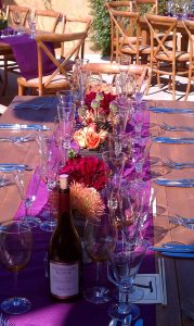
I used Plum Dahlias, orange pin cushion proteas, bullet allium and orange roses. I used what is called a “grouping” design, which essentially means a lot of all the same flowers together in a vase. On this table I had three long rectangular vases. Inside each rectangular vase were smaller square vases that held the flowers. Once the vases were on the table I added water to the long rectangular vases so that it appeared as if the flowers in the small square vases were floating inside the longer vases and once it got dark and the candles were lit, the candle light would reflect off all the glass and water for a beautiful, romantic ambiance. As you can see, I also incorporated groupings of votive candles.
Table Design #2
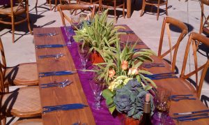
On this table I incorporated orange mokara orchids, large green succulents, orange cymbidium orchids and flax leaves. In this table design I used all 6” squared vases and each vase showcased a different kind of flower. I used the really large succulents so that I only had to use ONE per vase and again grouped votive candles in square glass in between and on the ends of the centerpiece.
Table Design #3
For the last table I used long rectangular wooden boxes and incorporated green millet grass with orange roses, green hydrangea and purple/green kale with groupings of square votives.
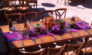
Below is a view from above at two of the table designs giving you an idea of how they all looked together. In the background you can see part of the lounge area where I incorporated a variety of pomanders on top of orange ceramic square vases with square votive candles as well.
It is super important that your colors work together with the environment. If this wedding had been in doors with teal carpets, this would not have looked as nice as it does in this photo because as you can see in the photo, even the concrete had a peach tone to it, which worked with and picked up the orange used in the centerpieces.


